About This Project
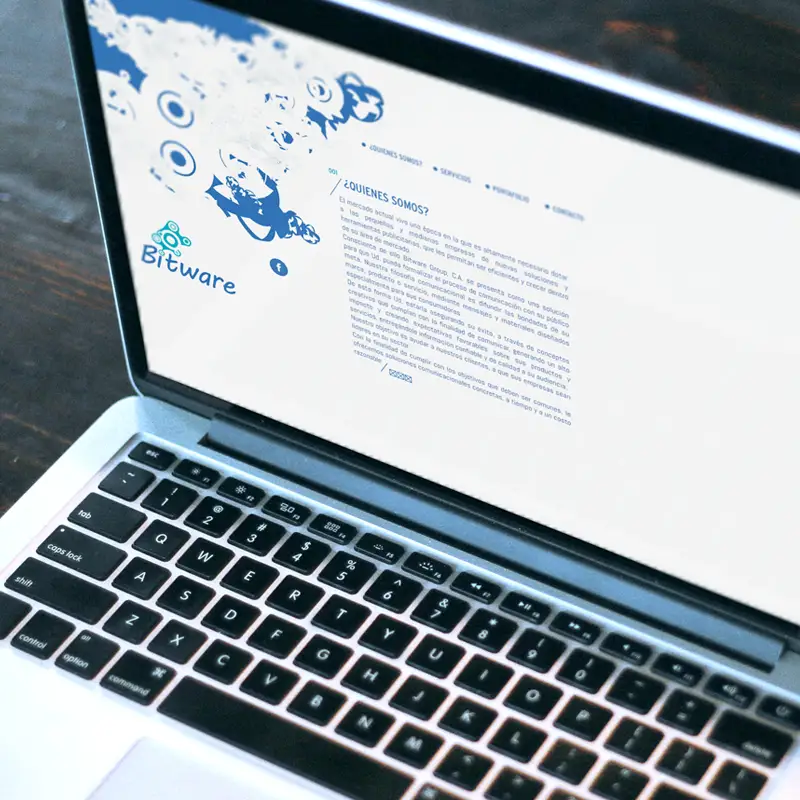
Bitware’s website projects a clean, modern digital aesthetic, with a visual identity that embodies the fusion of technology and creativity. The color palette dominated by shades of blue reflects innovation and professionalism, attributes the company is likely to want to associate with its brand.
The minimalist page layout, with efficient use of negative space, facilitates navigation and highlights menu options, offering an intuitive and uncomplicated user experience. This design helps avoid information overload and emphasizes ease of access to the company’s services.
The use of iconography and abstract graphics with digital technology elements – such as circuits and data structures – in the central part of the image communicates the company’s specialization in digital solutions. These visual elements serve to reinforce the cutting-edge nature of the company and its focus on transforming visions into reality, as the tagline suggests.
It was created in WordPress and Elementor.


