About This Project
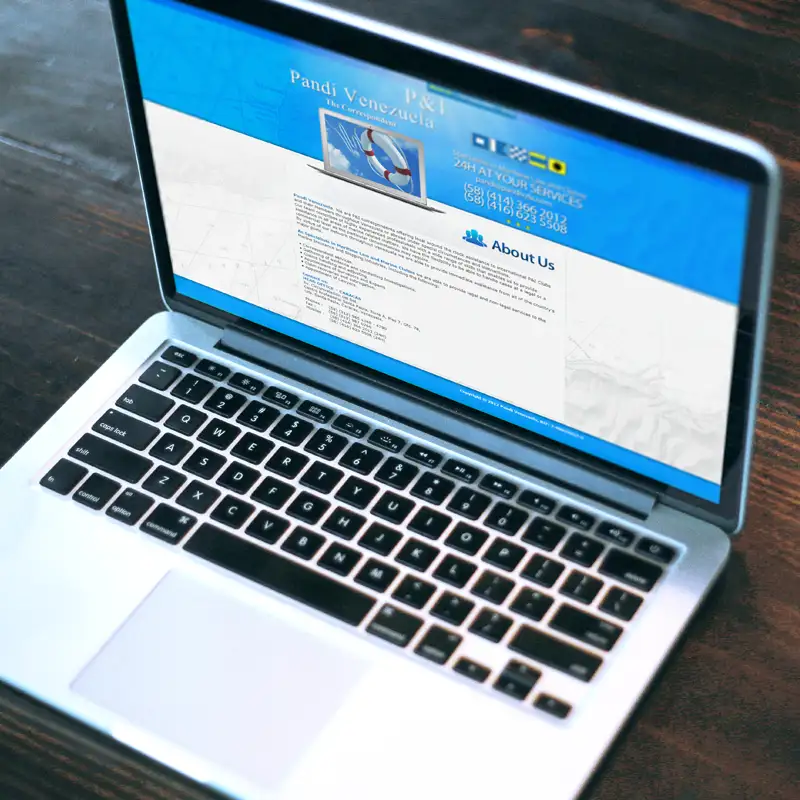
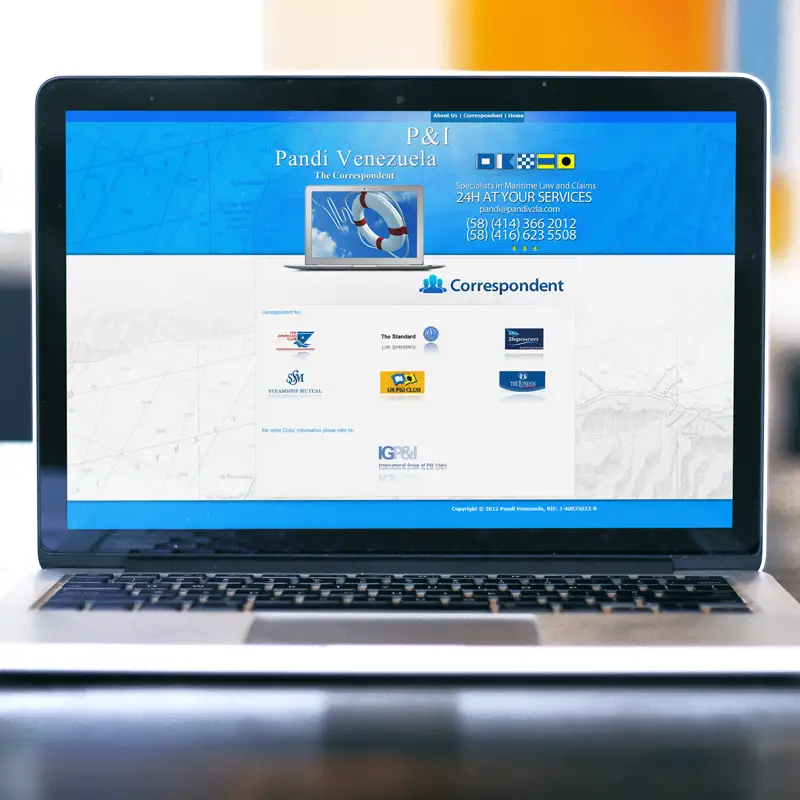
The aesthetics of the site uses a blue background that evokes feelings of the sea and navigation, in line with the company’s focus on the maritime sector. The design is simple and functional, with a balance between visuality and usability.
The overall design is simple, allowing users to focus on the most important information without unnecessary distractions. This is especially important on a corporate website where clarity and ease of access to information are prioritized over more elaborate design elements at the client’s request.


